
Flutter Buttons
Flutter provides several types of buttons that can be used in various contexts. Some of the most commonly used buttons in Flutter include.
- ElevatedButton: A Material Design raised button with customizable styles.
- OutlineButton: A button with a visible border but no visible background.
- IconButton: A button that contains an icon.
- RawMaterialButton: A Material Design button that can be configured to act like a regular button, a toggle button, or a radio button.
You can customize the appearance and behavior of these buttons by providing various arguments to their constructors and using different styling options.
For example, you can change the button’s text, font, color, shape, and other properties using the style and textStyle properties. You can also specify the button’s onPressed callback function, which will be invoked when the button is tapped.
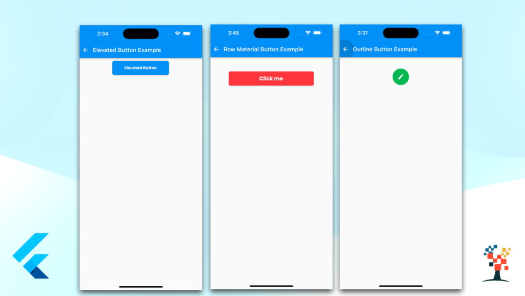
ElevatedButton in flutter
The ElevatedButton in Flutter is a Material Design raised button that has customizable styles. It is commonly used to indicate a primary or important action, and it appears to be floating above the interface.
The button’s text and icon can be easily configured, and you can also customize the button’s color, shape, and other properties.
When creating an ElevatedButton, you can provide an onPressed callback function, which will be invoked when the button is tapped. You can also use the style property to customize the button’s appearance.
For example, you can change the button’s primary and background colors, shape, and other properties using the ElevatedButton.styleFrom method.
 Center(
            child: Padding(
              padding: const EdgeInsets.only(left: 8.0, right: 10, top: 10),
              child: Container(
                width: 200,
                height: 50,
                child: ElevatedButton(
                  onPressed: () {},
                  style: ElevatedButton.styleFrom(
                    primary: Colors.blue,
                    backgroundColor: Colors.blue,
                    shape: BeveledRectangleBorder(
                      borderRadius: BorderRadius.circular(5),
                    ),
                  ),
                  child: const Text(
                    'Elevated Button',
                    style: TextStyle(
                      color: Colors.white,
                      fontFamily: 'Poppins',
                      fontWeight: FontWeight.w800,
                    ),
                  ),
                ),
              ),
            ),
          )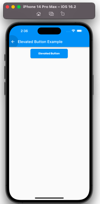

In this example, the button’s primary color is set to blue, its background color is set to blue, and it has a rounded border with a radius of 5. You can also set the text style for the button text color is set to white, the font family ‘Poppins’, and font-weight FontWeight.w800.
In general, the ElevatedButton is a great option when you want to indicate a primary or important action in your app. It is easy to customize and can be used in a variety of contexts. With its customizable styles, you can make it match your app’s design and branding.
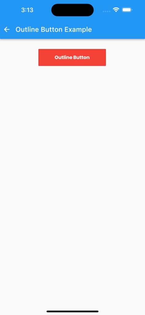
OutlineButton in flutter
The OutlineButton in Flutter is a Material Design button that has a transparent background and a border. It is commonly used to indicate a secondary or less important action, and it appears to be floating above the interface.
The button’s text and icon can be easily configured, and you can also customize the button’s color, shape, and other properties.
When creating an OutlineButton, you can provide an onPressed callback function, which will be invoked when the button is tapped.
You can also use the style property to customize the button’s appearance. For example, you can change the button’s color, shape, and other properties using the OutlineButton.styleFrom method.
  Widget outlineBtn() {
    return Center(
      child: Padding(
        padding: const EdgeInsets.only(left: 8.0, right: 10, top: 10),
        child: Container(
          width: 200,
          height: 50,
          child: OutlinedButton(
            onPressed: () {},
            style: OutlinedButton.styleFrom(
              backgroundColor: Colors.red.shade500,
              primary: Colors.blue,
              shape: BeveledRectangleBorder(
                borderRadius: BorderRadius.circular(1),
              ),
            ),
            child: const Text(
              'Outline Button',
              style: TextStyle(
                color: Colors.white,
                fontFamily: 'Poppins',
                fontWeight: FontWeight.w800,
              ),
            ),
          ),
        ),
      ),
    );
  }
IconButton in Flutter
The IconButton in Flutter is a button that displays an icon and responds to user interaction. It is commonly used for actions that are performed frequently or with a single tap, such as play/pause, volume control, or navigation.
The IconButton is a Material Design widget, and it automatically adapts to the platform’s theme and iconography.
When creating an IconButton, you can provide an onPressed callback function, which will be invoked when the button is tapped.
You can also use the icon property to specify the icon that should be displayed on the button.
Widget iconBtn() {
    return Container(
      decoration: BoxDecoration(
        border: Border.all(color: Colors.grey, width: 4.0),
        color: Colors.grey,
        shape: BoxShape.circle,
      ),
      child: Center(
        child: IconButton(
          icon: Icon(
            Icons.edit, color: Colors.black,
            // size: 20,
          ),
          onPressed: () {
            //your action
          },
        ),
      ),
    );
  }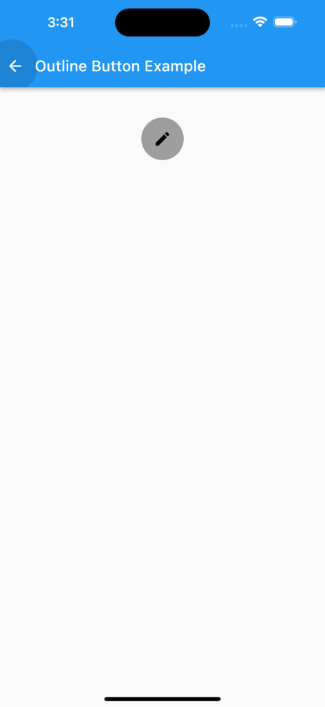

In this example, the button displays an edit icon, and when the user taps the button, the onPressed callback function is invoked.
You can also customize the icon button by providing a custom icon and color green/gray and for the icon, also you can customize the size of the icon.
The IconButton is a useful widget when you need to provide quick access to frequently used actions or navigation in your app.
It is easy to customize and works well with the Material Design guidelines.
RawMaterialButton in Flutter
The RawMaterialButton in Flutter is a Material Design widget that provides a button with a customizable shape, elevation, and color.
It is similar to the FlatButton and ElevatedButton widgets, but it provides more flexibility in terms of customization options.
It does not have a default visual appearance and does not automatically adapt to the platform’s theme, so it’s a good choice when you need to create a custom-looking button.
When creating a RawMaterialButton, you can provide an onPressed callback function, which will be invoked when the button is tapped.
You can also use the child property to specify the text or icon that should be displayed on the button.
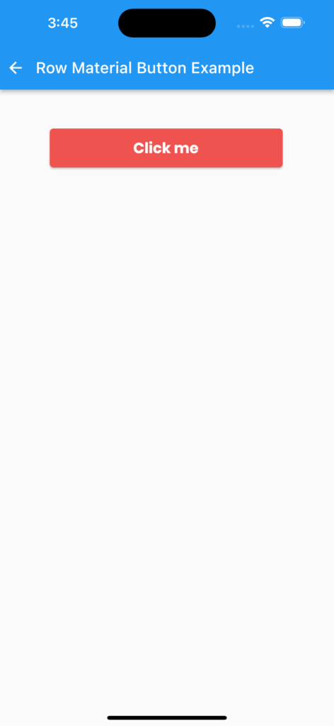

Widget rawMaterialbtn() {
    return Center(
      child: Padding(
        padding: const EdgeInsets.only(left: 8.0, right: 10, top: 10),
        child: Container(
          height: 50,
          width: 300,
          child: RawMaterialButton(
            onPressed: () {
              //your action click
            },
            child: const Text(
              "Click me",
              style: TextStyle(
                  color: Colors.white,
                  fontFamily: 'Poppins',
                  fontWeight: FontWeight.w800,
                  fontSize: 19),
            ),
            elevation: 2.0,
            fillColor: Colors.red.shade400,
            shape:
                RoundedRectangleBorder(borderRadius: BorderRadius.circular(5)),
          ),
        ),
      ),
    );
  }
I hope it was a useful article, please share and subscribe to my channel, Thanks for reading and if you have any questions or comments, See you soon.


Hello there, just became alert to your blog through Google, and found that it is really informative.
I am going to watch out for brussels. I’ll be grateful if you continue this in future.
Numerous people will be benefited from your writing. Cheers!
Your article gave me a lot of inspiration, I hope you can explain your point of view in more detail, because I have some doubts, thank you.