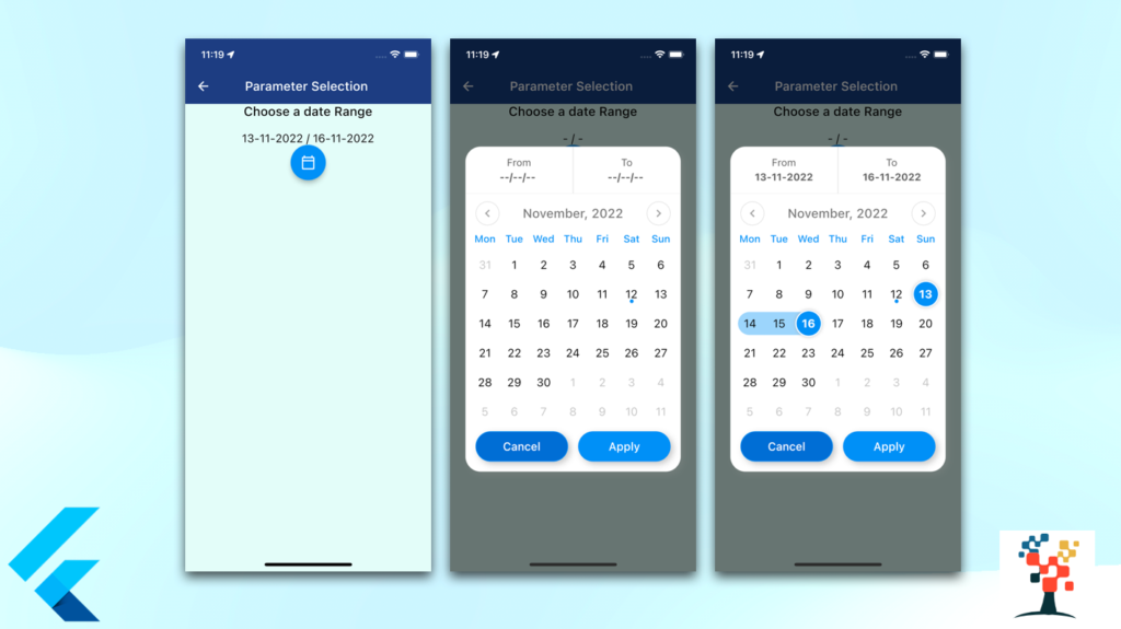
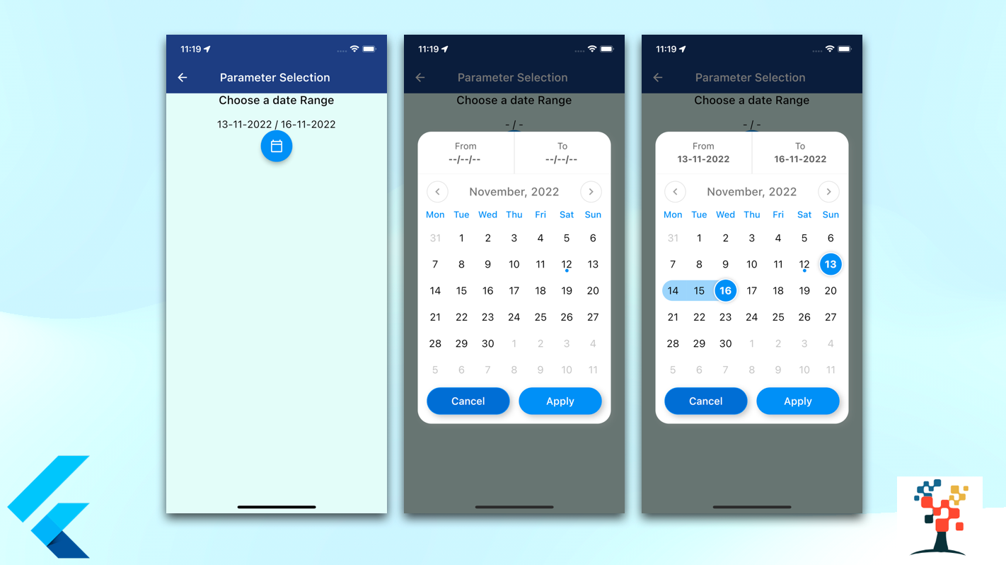
Hello developers, today I have selected a significant topic in flutter app development, day to day we have used the date select option in over mobile app so it’s a very important aspect to create a screen in a flutter developer very quickly way and beautiful layout of the screen. In this article, I have discussed the two date range selected on the value of the app like form date to date work with any chosen date.
how to create a date range picker in a flutter

This topic covers –
- how to create a date picker in a label to show the date.
- Flutter date range picker widget.
- How do you pick a date range in flutter?
- How do you customize the date range piker in flutter?
- How do you get the date format in flutter?
- Make range date piker in flutter.
- Top flutter date and time picker packages.
Let’s get started on the main steps!
installation of pub pod library in pubspec.yaml
Run this command:
$ flutter pub add custom_date_range_picker
Insert the main code on your app screen
  Widget dateRangeInfo() {
    return Center(
        child: Column(
      mainAxisAlignment: MainAxisAlignment.center,
      crossAxisAlignment: CrossAxisAlignment.center,
      children: <Widget>[
        const Text(
          'Choose a date Range',
          style: TextStyle(
              fontWeight: FontWeight.w500, fontSize: 20, color: Colors.black),
        ),
        const SizedBox(height: 20),
        Text(
          '${startDate != null ? DateFormat("dd-MM-yyyy").format(startDate!) : '-'} / ${endDate != null ? DateFormat("dd-MM-yyyy").format(endDate!) : '-'}',
          style: const TextStyle(
            fontWeight: FontWeight.w400,
            fontSize: 18,
            color: Colors.black,
          ),
        ),
        FloatingActionButton(
          onPressed: () {
            showCustomDateRangePicker(
              context,
              dismissible: true,
              backgroundColor: ColorConstant.black900,
              minimumDate: DateTime.now(),
              maximumDate: DateTime.now().add(const Duration(days: 30)),
              endDate: endDate,
              startDate: startDate,
              onApplyClick: (start, end) {
                setState(() {
                  endDate = end;
                  startDate = start;
                });
              },
              onCancelClick: () {
                setState(() {
                  endDate = null;
                  startDate = null;
                });
              },
            );
          },
          tooltip: 'choose date Range',
          child: const Icon(Icons.calendar_today_outlined, color: Colors.white),
        ),
      ],
    ));
  }
layout of the date range.


import package in your class
import 'package:custom_date_range_picker/custom_date_range_picker.dart';
import 'package:intl/intl.dart';
Youtube video (running example)
Access the Widget inside the class
 @override
  Widget build(BuildContext context) {
    return Scaffold(
      appBar: AppBar(
        automaticallyImplyLeading: false,
        title: Text('Parameter Selection '),
        centerTitle: true,
        backgroundColor: AppColors.headerColor,
        leading: IconButton(
          icon: Icon(Icons.arrow_back, color: Colors.white),
          onPressed: () => Navigator.of(context).pop(),
        ),
        elevation: 0,
      ),
      body: Container(
        color: AppColors.mainBg,
        child: Column(children: [
          Column(
            children: <Widget>[
              dateinfo(),
              ]
            ),
        ]),
      ),
    }
Conclusion:
In this article, we discussed the most beneficial part of the date range picker Screen text form and separated container with a button, to make our development life easier In future parts, I will share some important code of Date Range selection screen to make your Flutter Development journey a bit faster and many tips related to Flutter and Dart for more help please view over another article
I hope it was a useful article, please share and subscribe to my channel, You have enjoyed the most. Thanks for reading and if you have any questions or comments, See you soon.


