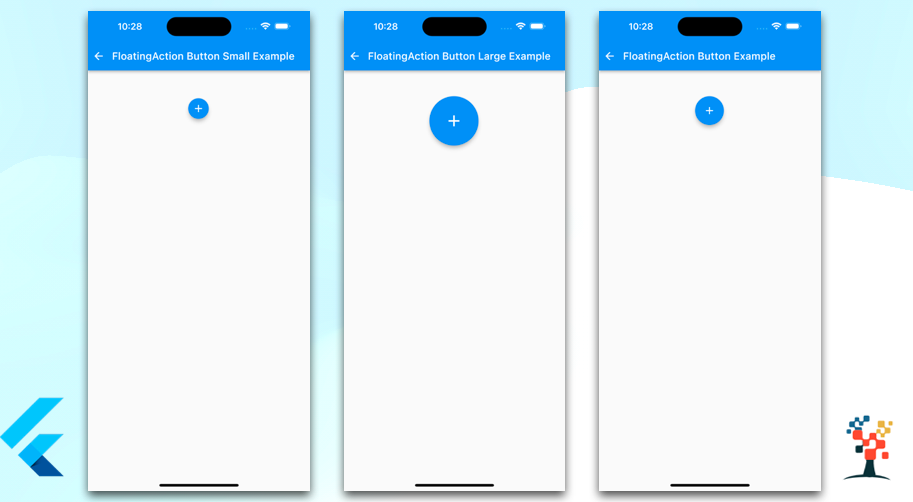
The FloatingActionButton in Flutter is a Material Design widget that provides a circular icon button that hovers above the interface.
It is commonly used for a promoted action, typically in the lower right corner of the screen, and it is designed to be used with the Scaffold widget.
When creating a FloatingActionButton, you can provide an onPressed callback function, which will be invoked when the button is tapped.
You can also use the child property to specify the icon that should be displayed on the button.
FloatingActionButton button
Widget flotbtn() {
    return Center(
      child: Padding(
        padding: const EdgeInsets.only(left: 8.0, right: 10, top: 10),
        child: Container(
          child: FloatingActionButton(
            onPressed: () {
              //your action code
            },
            child: Icon(Icons.add),
          ),
        ),
      ),
    );
  }
FloatingActionButton.small
  Widget flotbtn() {
    return Center(
      child: Padding(
        padding: const EdgeInsets.only(left: 8.0, right: 10, top: 10),
        child: Container(
          child: FloatingActionButton.small(
            onPressed: () {
              // your action code
            },
            child: Icon(Icons.add),
          ),
        ),
      ),
    );
  }
FloatingActionButton.large
  Widget flotbtn() {
    return Center(
      child: Padding(
        padding: const EdgeInsets.only(left: 8.0, right: 10, top: 10),
        child: Container(
          child: FloatingActionButton.large(
            onPressed: () {
              //your action code
            },
            child: Icon(Icons.add),
          ),
        ),
      ),
    );
  }
The FloatingActionButton is a useful widget when you need to provide quick access to a promoted action in your app. It is easy to customize and works well with the Material Design guidelines.
It’s a great choice to use when you want to give a user a way to perform an important action or add a new item with more flutter button examples.
I hope it was a useful article, please share and subscribe to my channel, Thanks for reading and if you have any questions or comments, See you soon.

