In Flutter, you can set a background image for a widget using the Container widget and its decoration property. Here are the steps to explain how to set a background image in Flutter:
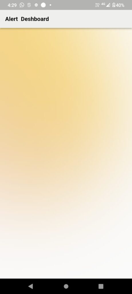
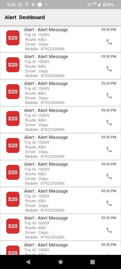
This is an output (sample example).

flutter background image
Package UI
Import the dart:ui package at the top of your file to access the Image class.
Image Upload in Server help of REST API
If you have uploaded an image in REST API Please go through the uploaded image in a flutter
In this article, I have used a Container property to show the background image on the full screen.
A container is a widget that allows you to create a rectangular visual element that can be styled and arranged in various ways. Here are some of the key features of the Container widget in flutter app development.
Child widget
This is very common and useful You can add a single child widget to a Container using the child property. This child widget will be displayed inside the Container.
  Container(
      width: double.infinity,
      child: Row(children: [
        Container(
          width: 45,
          height: 100,
          alignment: Alignment.centerLeft,
          decoration: BoxDecoration(
            borderRadius: BorderRadius.circular(10),
            color: Colors.red.shade700,
          ),
          child: Container(
              alignment: Alignment.center,
              child:const Text(
                "Sr No : 1",
                style: TextStyle(
                    color: Colors.white,
                    fontSize: 18,
                    fontWeight: FontWeight.bold,
                    wordSpacing: 5),
              )),
        ),
      ]),
    );
Padding
You can add padding to the contents of a Container using the padding property. This adds empty space around the child widget inside the Container.
Padding(
      padding: EdgeInsets.only(left:5.0,right: 5.0,top: 5.0,bottom: 5.0),),
Margin
You can add a margin to the Container itself using the margin property. This adds empty space around the Container itself.
margin: const EdgeInsets.only(left: 5.0, right: 5.0),Decoration
You can decorate the Container using the decoration property. This allows you to add a border, background color, background image, and other visual effects to the Container.
         decoration: BoxDecoration(
              image: DecorationImage(
                image: backgroundImageLocal,
                fit: BoxFit.cover,
              ),

              borderRadius: BorderRadius.circular(10),
              color: Colors.red.shade700,

            ),
Constraints
Will be set constraints on the size of the Container using the constraints property. This allows you to specify a minimum and maximum width and height for the Container.
constraints: BoxConstraints(
                  minHeight: 10
                  minWidth: 10,
                  maxHeight: 25,
                  maxWidth: 25),
ListView shows data under the container widget.

Final code
final AssetImage backgroundImageLocal =
      AssetImage('assets/images/background.png');

Widget build(BuildContext context) {
    return Scaffold(
        appBar: AppBar(
          title: const Text(
            'Alert Deshboard',
            style: TextStyle(
                color: Colors.black,
                fontSize: 18,
                fontWeight: FontWeight.bold,
                wordSpacing: 5),
          ),
          flexibleSpace: Container(
            decoration: const BoxDecoration(
              gradient: LinearGradient(
                begin: FractionalOffset(0.0, 0.0),
                end: FractionalOffset(1.0, 1.0),
                colors: <Color>[
                  Color.fromARGB(255, 239, 239, 238), //#6ABD46
                  Color.fromARGB(255, 239, 239, 238),
                ],
                stops: <double>[0.0, 1.0],
                tileMode: TileMode.clamp,
              ),
            ),
          ),
        ),
        body: Container(
            decoration: BoxDecoration(
              image: DecorationImage(
                image: backgroundImageLocal,
                fit: BoxFit.cover,
              ),
              borderRadius: BorderRadius.circular(10),
              color: Colors.red.shade700,
            ),
            child: Stack(children: <Widget>[
              ListView.builder(
                itemCount: 10,
                shrinkWrap: true,
                itemBuilder: (context, index) {
                  return Container(
                    decoration: BoxDecoration(
                      color: Colors.white,
                      borderRadius: BorderRadius.circular(2),
                      border: Border.all(
                        color: Colors.black,
                        width: 0.20,
                      ),
                    ),
                    child: ListTile(
                      leading: Padding(
                        padding: const EdgeInsets.only(
                          left: 5,
                          bottom: 5,
                        ),
                        child: Container(
                          width: 45,
                          height: 120,
                          alignment: Alignment.centerLeft,
                          decoration: BoxDecoration(
                            borderRadius: BorderRadius.circular(10),
                            color: Colors.red.shade700,
                          ),
                          child: Container(
                              alignment: Alignment.center,
                              child: const Text(
                                "S20",
                                style: TextStyle(
                                    color: Colors.white,
                                    fontSize: 18,
                                    fontWeight: FontWeight.bold,
                                    wordSpacing: 5),
                              )),
                        ),
                      ),
                      title: Row(
                        mainAxisAlignment: MainAxisAlignment.spaceBetween,
                        children: [
                          Expanded(
                            child:const Text(
                              "Alert : Alert Message",
                              overflow: TextOverflow.ellipsis,
                              maxLines: 1,
                            ),
                          ),
                          const Text(
                            "05:30 PM",
                            style: TextStyle(
                              fontSize: 12.0,
                            ),
                          ),
                        ],
                      ),
                      subtitle: Row(
                        children: [
                          Expanded(
                            child: Text(
                              "Trip Id: 10009\n Route: ABU\n Driver : Depu \n Mobile : 87922XXX86",
                              //maxLines: 2,
                            ),
                          ),
                          IconButton(
                            onPressed: () {},
                            icon: Icon(
                              Icons.call,
                              color: Colors.grey,
                            ),
                          ),
                        ],
                      ),
                    ),
                  );
                },
              ),

          ])));
  }
Box Decoration image in a flutter
You can decorate the Container using the decoration property. This allows you to add a border, background color, background image, and other visual effects to the Container.
I hope it was a useful article, please share and subscribe to my channel, Thanks for reading and if you have any questions or comments, See you soon.


