Hello developers, today I have created a radio button in our iOS and android app add one important topic “How to Add Radio Button in Flutter”, this topic is very interesting for a common purpose and every flutter developer almost used this functionality in the app development( like gender selection, payment mode selection on/ off selection and much more), today I’m using the normal binding(radio button) and API responses base binding radio button in flutter project used.
You can add radio buttons in the Flutter app with Radio() widget. In very simple ways implementation radio button helps chart the radio button.
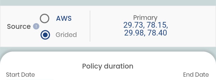
Radio Button
- value is the value represented by this radio button(initialization the top of the screen for example – (String? selectRadioBtn = ‘’;))
- groupValue is the value that is currently selected for this group of radio buttons.
- onChanged is the callback function that is called when the user selects this radio button to update the widget.
Initialization for: How to Add Radio Button in Flutter
  String? radioSourceGroup;
  List<String> radioSourceList = ["lbl_aws", "lbl_grided", "lbl_Other"];
Function Create Radio Button
 void radioButtonChangesSource(String value) {
    setState(() {
      radioSourceGroup = value;
      switch (value) {
        case 'lbl_grided':
          choice = value;
          setState(() {
            radioSourceGroup = value;
          });
          break;
        case 'lbl_aws':
          choice = value;

          setState(() {
            radioSourceGroup = value;
          });

          break;
        case 'lbl_other':
          choice = value;
          break;
        default:
          choice = null;
      }
      debugPrint(choice);
    });
  }
Condition selection based on the radio button auto
     if (ppS == 'grid') {
          choice = 'lbl_grided';
          radioButtonChangesSource(choice.toString());
        } else if (ppS == 'station') {
          choice = 'lbl_aws';
          radioButtonChangesSource(choice.toString());
        } else if (ppS == 'lbl_Other') {
          //no slection
        }
Show widget
                               Column(
                                    children: [
                                      CustomRadioButton(
                                        text: "AWS",
                                        iconSize: 18,
                                        value: radioSourceList[0],
                                        groupValue: radioSourceGroup,
                                        margin: getMargin(
                                          right: 10,
                                        ),
                                        onChange: radioButtonChangesSource,
                                      ),
                                      CustomRadioButton(
                                        text: "Grided",
                                        iconSize: 14,
                                        value: radioSourceList[1],
                                        groupValue: radioSourceGroup,
                                        margin: getMargin(
                                          left: 2,
                                          top: 11,
                                          //bottom: 3,
                                        ),
                                        fontStyle:
                                            RadioFontStyle.PoppinsRegular12,
                                        onChange: radioButtonChangesSource,
                                      ),
                                    ],
                                  ),
How to Create a Custom Radio Button
import 'package:flutter/material.dart';
import 'package:app/core/color_constant.dart';//you change as per your need
import 'package:app/core/size_utils.dart';
import 'package:app/utlity/colors.dart';//you change as per your need

class CustomRadioButton extends StatelessWidget {
  CustomRadioButton(
      {this.shape,
      this.padding,
      this.fontStyle,
      this.margin,
      this.onChange,
      this.iconSize,
      this.value,
      this.groupValue,
      this.text});

  RadioShape? shape;

  RadioPadding? padding;

  RadioFontStyle? fontStyle;

  EdgeInsetsGeometry? margin;

  Function(String)? onChange;

  double? iconSize;

  String? value;

  String? groupValue;

  String? text;

  @override
  Widget build(BuildContext context) {
    return Padding(
      padding: margin ?? EdgeInsets.zero,
      child: InkWell(
        onTap: () {
          onChange!(value!);
        },
        child: Row(
          children: [
            SizedBox(
              height: getHorizontalSize(iconSize ?? 0),
              width: getHorizontalSize(iconSize ?? 0),
              child: Radio<String>(
                activeColor: AppColors.payoutRadioBtnColor,
                value: value ?? "",
                groupValue: groupValue,
                onChanged: (value) {
                  onChange!(value!);
                },
              ),
            ),
            Padding(
              padding: getPadding(
                left: 10,
              ),
              child: Text(
                text ?? "",
                textAlign: TextAlign.center,
                style: _setFontStyle(),
              ),
            ),
          ],
        ),
      ),
    );
  }

  _setFontStyle() {
    switch (fontStyle) {
      case RadioFontStyle.PoppinsRegular12:
        return TextStyle(
          color: ColorConstant.gray600,
          fontSize: getFontSize(
            12,
          ),
          fontFamily: 'Poppins',
          fontWeight: FontWeight.w400,
        );
      case RadioFontStyle.PoppinsMedium12:
        return TextStyle(
          color: ColorConstant.indigo800,
          fontSize: getFontSize(
            12,
          ),
          fontFamily: 'Poppins',
          fontWeight: FontWeight.w500,
        );
      default:
        return TextStyle(
          color: ColorConstant.indigo800,
          fontSize: getFontSize(
            13,
          ),
          fontFamily: 'Poppins',
          fontWeight: FontWeight.w500,
        );
        ;
    }
  }
}

enum RadioShape {
  CircleBorder9,
}

enum RadioPadding {
  PaddingAll2,
}

enum RadioFontStyle {
  PoppinsMedium13,
  PoppinsRegular12,
  PoppinsMedium12,
}
mobile screen layout DESIGN WIDTH & DESIGN HEIGHT
import 'package:flutter/material.dart';

Size size = WidgetsBinding.instance.window.physicalSize /
    WidgetsBinding.instance.window.devicePixelRatio;
const num DESIGN_WIDTH = 360;
const num DESIGN_HEIGHT = 800;
const num DESIGN_STATUS_BAR = 24;

///This method is used to get device viewport width.
get width {
  return size.width;
}

///This method is used to get device viewport height.
get height {
  num statusBar =
      MediaQueryData.fromWindow(WidgetsBinding.instance.window).viewPadding.top;
  num screenHeight = size.height - statusBar;
  return screenHeight;
}

///This method is used to set padding/margin (for the left and Right side) & width of the screen or widget according to the Viewport width.
double getHorizontalSize(double px) {
  return (px * width) / DESIGN_WIDTH;
}

///This method is used to set padding/margin (for the top and bottom side) & height of the screen or widget according to the Viewport height.
double getVerticalSize(double px) {
  return (px * height) / (DESIGN_HEIGHT - DESIGN_STATUS_BAR);
}

///This method is used to set smallest px in image height and width
double getSize(double px) {
  var height = getVerticalSize(px);
  var width = getHorizontalSize(px);
  if (height < width) {
    return height.toInt().toDouble();
  } else {
    return width.toInt().toDouble();
  }
}

///This method is used to set text font size according to Viewport
double getFontSize(double px) {
  return getSize(px);
}

///This method is used to set padding responsively
EdgeInsetsGeometry getPadding({
  double? all,
  double? left,
  double? top,
  double? right,
  double? bottom,
}) {
  return getMarginOrPadding(
    all: all,
    left: left,
    top: top,
    right: right,
    bottom: bottom,
  );
}

///This method is used to set margin responsively
EdgeInsetsGeometry getMargin({
  double? all,
  double? left,
  double? top,
  double? right,
  double? bottom,
}) {
  return getMarginOrPadding(
    all: all,
    left: left,
    top: top,
    right: right,
    bottom: bottom,
  );
}

///This method is used to get padding or margin responsively
EdgeInsetsGeometry getMarginOrPadding({
  double? all,
  double? left,
  double? top,
  double? right,
  double? bottom,
}) {
  if (all != null) {
    left = all;
    top = all;
    right = all;
    bottom = all;
  }
  return EdgeInsets.only(
    left: getHorizontalSize(
      left ?? 0,
    ),
    top: getVerticalSize(
      top ?? 0,
    ),
    right: getHorizontalSize(
      right ?? 0,
    ),
    bottom: getVerticalSize(
      bottom ?? 0,
    ),
  );
}
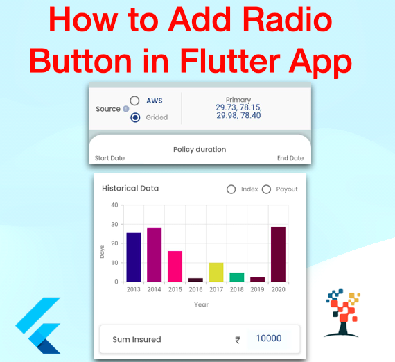
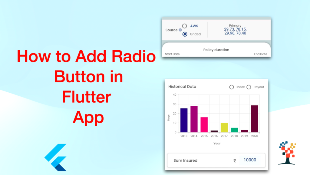
Output
I hope it was a useful article, please share and subscribe to my channel, You have enjoyed the most. Thanks for reading and if you have any questions or comments, See you soon.